Friday, 15 April 2011

Evaluation of magazine

Kelly Whitehurst
Evaluation of Music Magazine

The brief for this coursework was to make an original music magazine that includes at least four original images.  For this piece of work I had to make a front cover, contents page and a double page spread. Whilst doing this piece of work I looked at different types of music magazines and the different conventions and genre’s of music. I chose Pop as the genre I wish to study, to help me fulfil what I needed to do I analysed three Music Magazines which where X Factor which was published by Fremantle media, XXL published by Harris publications and finally NME which is published by IPC media. I looked at XXL and NME because they weren’t many Pop magazines which I could look at so by doing XXL and NME I felt they would have been the closest to Pop instead of doing The Metal Hammer magazine which would have being the total opposite to what I wish to achieve. I made plans of how I wanted my own music magazine to look like I drew them and also planed them out using Microsoft Publisher to get a good draft of what I wanted my magazine to look like.

I decided that my magazine would be targeted at people from the ages of 10 to 18 and maybe even beyond depending on people’s choice of music. The genre I chose for my magazine was Pop. Because my magazine was going to be targeted a rather young age I had to choose my images and text carefully to make sure it was a good representation to people of young ages. My music magazine uses conventions of real media products such as; I have a barcode on my magazine front cover, a price and an issue number by having these I was making my product more real to life, because these are the conventions a normal music magazine would have. I used a running theme though my magazine with the same colours and photos running though. On my front cover the colours where Yellow, Green and Red. The Colours on my contents page are Black, Yellow, Green and Red. On my double page spread the colour scheme was different to the front cover and contents page, but I found that the colours still flow because they are bright; I used bright pink and white. I chose my font colour wisely because I wanted the colours to attract the audience and I wanted it to reflect my music genre. All the images on my magazine are original images.  I thought carefully about my front cover images so that I could put text around the photo and a masthead above in total I had three different photos for my front cover, the final cover I felt worked the best because it is fun, girly and she is looking straight at the audience. The images on my double page spread where hard to do because I couldn’t take photos that went across two pages because of the fold in the middle of the page. Because of this I chose to have to strips of different images at either side of the fold with the text on either side of the page. I used the same font for my text on the front cover, contents page and double page spread the text was Arial. I chose this font because I thought that it is legible but yet quite poppy. I felt that my contents page had the conventions of a real music magazine by the variation of text and images, and in the left corner of my contents page there was a little photo of my font cover I chose to do this because I saw it on many other contents pages and I wished to make my magazine have the best magazine conventions as I could.  

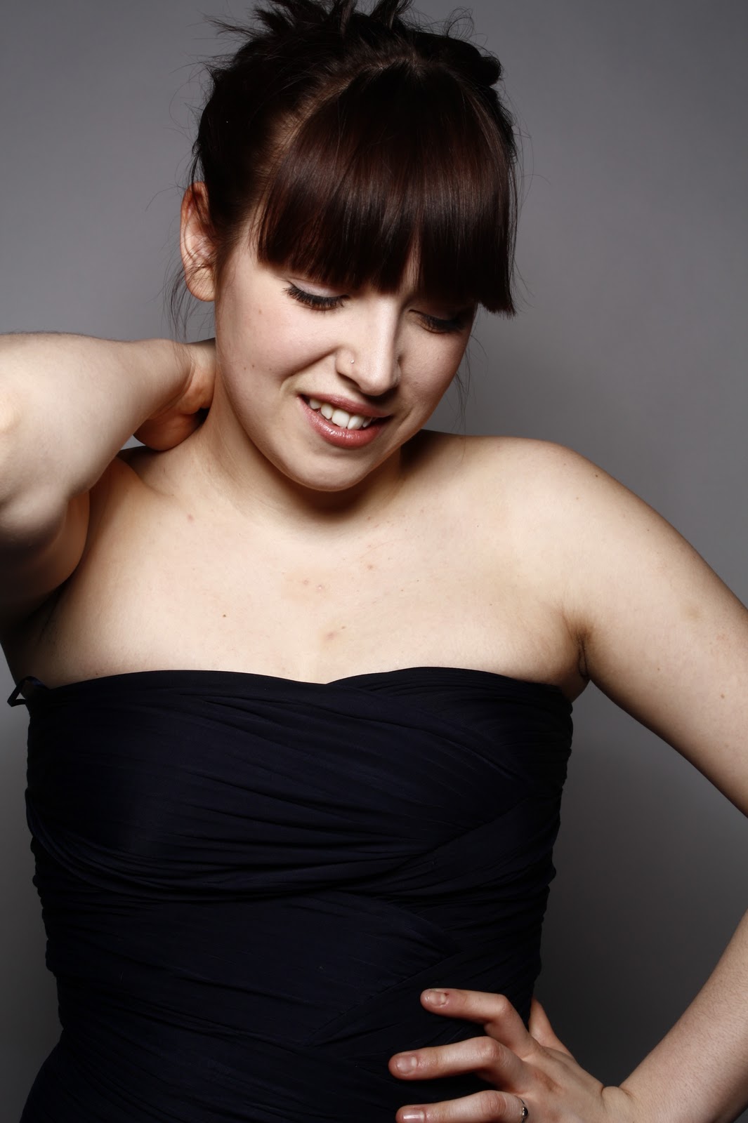
I had to do three different music magazine front covers. I did this because I didn’t feel that they really worked with the conventions I was going for and that it could be highly improved. My first font cover was rushed and not thought through, it was two girls dressed up and stood to one side of the shot, but the text was hard to place on the image and even when I had done the text it didn’t look like a magazine front cover. The text I used had serifs on the end of the letters so it’s connotations were very old fashioned and not the look I was going for, it wouldn’t fit in the genre of pop. My second front cover was a medium close up of just one girl. I could then put text all around her head and a masthead above her head, but the model was not making eye contact with the camera therefore I didn’t feel like the magazine would really connect with the audience. The text on my second front cover was similar to the text on my first front cover I have the same reasons for changing the text which was because of the serifs. Finally, on my final front cover I have a close up shot of the same girl on my second front cover pulling a funny face, I felt this worked best with my genre pop because pop is meant to be happy, exciting and a little rebellious. The text I used for this front cover I felt worked well, it was plain and simple and straight to the point. The colours were bright and vibrant which made the front cover stand out. The masthead I chose also changed from BLISS which was the first magazine masthead, to GLOW which is the second and final magazine masthead. I chose to change the name of my magazine because I felt BLISS could also be seen as an r ‘n’ b masthead name and I wanted the audience to be able to look straight at the magazine and think ‘yeah this is a pop magazine’. Not only did I do this though the title but I thought by the colours I chose to use this made you realise that my magazine is a pop magazine, because of the brightness a rock magazine wouldn’t have bright yellow and green on the front cover. My double page spread is also bright and stands which I chose to do so that it would flow with the rest of the magazine. I used the same font for ‘RUBY RED’ on the front cover to introduce her, and the masthead on the double page spread. I did this so that you would have some continuity within the front cover and the double page spread.

The institution that I feel my music magazine would be mainstream and fit under would be the same institution as the XXL magazine published by Harris publications, because they don’t have a pop magazine under this publication. The reason I wouldn’t chose Fremantle Media is because X factor magazine is within that publication and these magazine’s would be rivals.

For my music magazine I got some audience feed back which was a mix of qualitative date and quantitative data. I used a questionnaire format and gave them to 10 different people a mixture of boys and girls. All of the people that did my questionnaire said that the genre of my magazine was Pop which is good it shows that the connotations I used to try and make my magazine look this way worked. The reason people chose this was because of the funny photo on the front cover and the photos on the double page spread and the bright colours on all three pages. The average voting for my front cover was 7  people chose this because they liked the choice of imagery and colour scheme. Although, some people said it would have worked better if I thought about a different masthead. The majority of the feed back to get for my contents page wasn’t very good, because it looked more like a poster and not a magazine contents page which I could work on to make this better. The audience feed back I got for my double page spread was good the average people said that it would be an 8. Because the choice of questions and answers, the colours and the photos. People liked the questions and answers because they don’t like reading lots of text so by doing this it makes the double page look more formal and tidy.

While I was making this music magazine I have learnt a lot of things. For example, I have learnt about different music institutions such as, IPC and Bauer Media Group.  Secondly I learnt how to analyse magazines by looking at the Language, Institution, Audience and the Representation of the product. By doing this piece of work I have had to take some of my own original images which taught me things like choosing the correct scene that would fit with the image I wished to take, also getting a good enough camera to take good quality photos. Looking back on my preliminary task where I had to make a college magazine I have learnt a lot from then. I knew whilst doing that magazine that I needed to follow the audience I was aiming for and good representation that a college would wish to have. The main thing that I have learnt the most doing my preliminary task and my music magazine was how to work Photoshop, before I started doing media I didn’t have a clue about Photoshop I had never been on it in my life, now I feel happy creating my own pieces of work though Photoshop and feel that it is a fantastic skill I have learnt to do.


My final music magazine looks like this:


Thursday, 14 April 2011

Audience feed back

Audience feed back

  1. Which genre do you think my magazine is from:
    • Indie?
    • Pop?
    • RnB?
 
  1. Why did you pick this genre?


  1. On a scale of 1 to 5 what do you rate my front cover? (1 been the least)

1             2             3           4             5

  1. What do you think I could improve on my front cover?


  1. On a scale of 1 to 5 what do you rate my contents page?


1             2             3           4             5

  1. What do you think I could improve on my contents page?


  1. On a scale of 1 to 5 what do you rate my double page spread?


1             2             3           4             5

  1. What do you think I could improve on my contents page?


  1. How would you rate the whole magazine?


1             2             3           4             5


Wednesday, 23 March 2011

Music Magazine


MY DOUBLE PAGE SPREAD INTERVIEW


Hello, welcome to our official interview with Ruby Red, this beautiful lady is here today to tell us all about her new success and how she is enjoying being in the sparkling spot light.
Well hello there Ruby

Ruby: Good morning, it is nice to finally meet you and do an interview everything has just being go, go, go!
How are you liking being in the lime light?
Ruby: It is great, I really couldn’t grumble I am at the best point in my life. At first I won’t lie it was a bit of a shock people recognising me and shouting my name I got quite scared because I used to be a very shy person first meeting people, but now I love it, if you don’t want to be spoke to in the street and recognised then there is no point in becoming famous. It is very nice to meet you as well, how is everything going in the world of pop at the moment then?
Ruby: Everything is going amazing it couldn’t be better to be honest. There are some amazing other artists out there at the moment and it is so flattering knowing that I am In this week’s top 10 and hopefully working my way up to the top spot.
I know that is amazing, I bet you are so happy! What are you working on at the moment?
Ruby: Well as you all know I have just released my first album and I am already working on my second and trust me if you love the first one you are going to love the second.
Oooo this sounds promising! Is the second album going to have some different styles of music on it?
Ruby: Well that would be telling...
To read more on our Ruby also known as Ruby Red turn to pages 4 and 5...

Photos I took for my magazine


Friday, 17 December 2010

My front cover, Draft of contents page and Draft of double page spread

Contents page
Double page spread

Double Page Spead Interview Not The Final Piece

This is the text I have chose to put on my double page spread. I chose to do it in a interview form with questions and answers because when I did my pole on my blog, people answered to liking more pictures and not a lot of text and also people voted to liking interviews more.


This brand new girl band called Blushing Beauty they are have very kindly done their very first interview with us all exclusive no other magazine will be getting all the ins and outs like we will be.  Blushing Beauty first rose to fame earlier this year and have only just decided to do an interview as they thought if they slip up like girls normally do, then they didn’t want to put a shadow over anything they may do in the future.
Now, girls how’s the fame and are you all enjoying the attention?
Laura- the fame and the attention is great we are both really enjoying it, but to be honest I think Sammie is enjoying the attention the most she loves being in the spot light
(
Giggles from the girls)
Sammie- Err I don’t think so, although I’m not going to complain it has being amazing and where having the time of our lives
How is the new album going?
Laura- The album is going great better then we could have ever asked for thank you
Sammie- yeah just as Laura said its being great we went straight in the top 10 and at the moment are working our way up to the top spot
Now, all our male fans will want to know the big question have you got boyfriends?

(Giggles from the girls)
Sammie- Yes, I’m sorry guys I do I’m not going to say too much about him though because we have agreed to keep our relationship on the down low we know what peoples relationships go though being dragged though the press
Laura- I am also taken sorry fellows
To get more Goss on the girls read pages 5 & 6...

Wednesday, 15 December 2010

Thursday, 9 December 2010

This is a mock up of what my front cover is going to look like.


This is a Mock up of my contents page.


Finally, this is a mock of my double page spread.


Wednesday, 24 November 2010

Liiar analysis of three media magazines


X Factor Magazine
Language- There is six photographs on the front of the x factor magazine, there is one main image which takes up the majority of the front cover but has being put to the right slightly which makes the editor able to put in some inserts to the front cover which are the other five images.  The magazine uses very bright colours which connect with the connotations of pop music, the colours used are; bright pink, bright yellow, white, black and red all these colours draw you in to the magazine and make you want to pick it up and have a look. The text shown on the front cover seems very persuasive it only shows a snippet of each story but it makes you want to read more.  The mast head on the magazine is in the top left corner and they have made the main image cover a bit of the masthead. They have used the logo for the X off x factor which would show the reader straight away what the magazine is going to be about because the logo is very well known.
The contents page of the magazine shows a flow from the front cover by the use of bright colours and also some of the same people on the pictures what are on the front cover. In the contents page there are five pictures and a band of little photographs along the bottom showing who is still in the x factor. The colours used in the contents page are; blue, pink, yellow and red. The contents page is nicely laid out it gives titles then what it going to be under that section so stories are easier for the reader to find.
The double page spread has four photographs within, the interview is with Danni who was the main and is a question and answer interview. There is a big image of Danni then little inserts of her whilst being on the x factor as a judge.  The masthead of the double page spread is a quote from Danni “Aiden is hilarious, but how could I get that across?”
Institution- The x factor magazine is published by Fremantle media, who are a large global company.
Fremantle Media is one of the world's largest and most successful creators, producers and distributors of outstanding entertainment brands. From prime time and serial drama to entertainment and factual entertainment, our programmes continue to excite, challenge, entertain and inspire audiences around the world. This is a quote from the site: http://www.fremantlemedia.com/About_Us.aspx this shows that the publication is does not only publish magazines but also creates serial dramas.
Ideology- The x factor magazine comes across respectful and the people on the magazine could be teenagers and adults role models. On the front of the magazine there are all nice images know body is upset or drinking alcohol or smoking thing that are not very respectful and things that people don’t want their children to be seeing. Because this would be the first thing people see when they pick up the magazine you don’t want anything to be portrayed in a bad way.
Audience-The audience of the x factor magazine is proven to be more women and young girls who buy the magazine and not so much men. The magazine looks a little bit like a woman’s chat magazine would look; it’s all about different people’s stories and is set out a bit like the heat magazine and the closer magazine, very bright colours and quite girly colours.
Representation- By looking at the artists shown on the front of the magazine it would help the reader get a feel to what genre of music the magazine is going to be about. If the people on the photos was wearing all black and had drums and guitars this would show a heavy metal band which would create a total different feel for the magazine, but because its well groomed good looking men and women it’s again showing the stereotypical image of pop groups which would be “perfect” girls and “perfect” boys.
 XXL Magazine
Language- there is only one main image on the front of the XXL magazine and it really tells you about the audience which this magazine would cater for. The image is very bold and stands out because it covers a bit of the mast head which makes the picture stand out more. The colours used on the front of the magazine are grey, black, white and red. The red masthead and the gold jewellery really make the magazine more attractive because the dim colours don’t make the magazine very eye catching. It looks as if the photographer has purposely centred 50 Cent and Soulja boy to the right so that they could insert writing down the left hand side and so it all looks tidy they have made it all in line with the mast head. The mast head XXL could mean a lot of things but this magazine seems very stereotypical towards rappers and gangsters their for it would be to do with things thing that these types of people like or what there wear, for example baggy jeans could be XXL. Also it seems like the people focused in this magazine are very rich with all the jewellery they wear which make you think they do things a bit bigger than the rest of us. They have followed the image on from the front cover of the same two people and have kept them to the right with the writing on the left hand side. The same colours have also being used which is a good flow between the two. The double page spread is also about the same two people, there is still like the rest of them only one image and the colours are also still the same.
Institution- The institution of XXL magazine is Harris Publications. This is from the site http://en.wikipedia.org/wiki/Harris_Publications Harris Publications Inc. is a consumer magazine publisher located in New York that publishes over 75 titles including: Juicy, XXL, Small Business Opportunities, Start Your Own Business, Men's Workout, Exercise & Health, Celebrity Hairstyles, Tactical Knives, Combat Handguns, and many more. One major division, Harris Outdoor Magazines, publishes several titles on hunting, fishing, and firearms.
Ideology- XXL magazine could be quite controversial on whether or not the magazine could be representing good behaviour and good role models. This could be because of the image on the front of the magazine, the two men on the front are very well known rappers what young boys do look up too. But all the tattoos all over soulja boy’s body and 50 Cent in the balaclava don’t show a very positive image.
Audience- The audience of XXL magazine would be people that are into this type of music. I think that the audience would lean towards more male buyers of the magazine than women buyers. The front cover of the magazine makes it look more masculine. Finally, I think that the ages of the people buying the magazine would be teenagers and people in their twenty’s because not many older people like rap music and this type of scenery.
Representation- I think that the representation of this magazine is good and what the creator was looking for, because it shows well the genre of what the magazine is going to entail. The colours of the magazine are a good choice as well because if it was very bright colours and girly colours like pinks it wouldn’t represent the magazine like it should be and people would get  very confused about the image the magazine is wanting to portray.


NME
Language-The image on the front of this magazine is in black and white and the Mast head and the main focus what the magazine includes is in red. This makes the mast head and the heading stand out and makes the reader focus on it. The image would also draw peoples attention because unlike other magazines this one has the image of a famous member of a band swearing. What’s good about this image is that you feel as if his fingers are coming out at you, because they cover a bit of the mast head. The image is placed in the middle of the page but because the background is white this works and allows you to put text at both sides of the image. The man is also wearing a black jacket and the text goes cross his body but the text is white and red so it is a good choice of colours. The Contents page has a good flow of colours with using black and white text and also an advertisement which is red. There are seven images on the contents page each showing who is involved in this publication of NME. The biggest image on the contents page is also in black and white like the front cover. On the double page spread, is the band which had to lead singer on the front cover. There is a big photograph and only a little paragraph of text; the colours used are teal, pink, yellow, red, and blue, green, black and white. This is a lot of different colours and you wouldn’t think that they would go with each other but because the image is on a white back ground they all stand out and look good. Institution- The institution of NME magazine is ipc media. This is a quote from the site http://www.ipcmedia.com/about/ The International Publishing Corporation Ltd was formed in 1963. IPC Media produces over 85 iconic media brands, with our print brands alone reaching almost two thirds of UK women and 44% of UK men –almost 27 million UK adults – while our online brands collectively reach 20 million users every month. 
Ideology- The ideology of the NME magazine could come across and quite controversial because on the front cover it has somebody swearing on it. I feel that the type of people that would buy this magazine wouldn’t be bothered by the image on the front cover so it’s ok and would be acceptable to them. Audience- I found the audience of NME magazine from the media pack. The magazine would attract more male readers then female and the percentage is 74% male and 26% female. The people that would buy this magazine will be people that are obsessed with music and love bands and knowing things about the latest bands. Finally, it would appeal to people that go to festivals as the magazine has the types of bands at festivals and has a festival feel to it, also the magazine actually features the festivals when they are on. Representation- I think the representation of this magazine is good, and that the image on the front cover would represent the type of people that would buy this magazine well. Although it doesn’t really show the type of genre of the magazine, maybe this is because the magazine could vary through many different genres therefore it wouldn’t be right to focus upon one. On the other hand, maybe they didn’t choose to make this publication of NME to focus upon a genre because the man on the front is from the band Pulp and people know what type of music they do therefore they would be no need to dress him up in a certain way.


Thursday, 11 November 2010

The Music Magazine Brief

 For this piece of coursework, I have to create an original music magazine. I will have to choose the genre of my magazine for example; dance, pop, mental, rnb. For this magazine I have to get at least four original images for the magazine and also do a front cover, contents page and double page spread..


What is the chosen music genre, which your magazine will focus upon?
I have chosen pop music to do my music magazine on.


What are the key feature of pop?
Pop music has always been thought to be very cheesy, in the music magazines for pop they use very bright colours to identify them. Most pop bands have this stereotypical image of being “perfect” they have to be innocent because the majority of the audience for pop would be teenagers and young children. More key features would be things such as; happy, girly and they would wear fashionable clothes which is different to how it used to be 10 years ago as they would wear crop tops and little shorts.

What magazines are currently in publication that cover this genre?
They isn’t that many magazines that cover pop music,  top of the tops which has a very stereotypical image for pop, sugar and the X Factor magazine. I couldn't find top of the tops or sugar magazines so i have chosen to analyse the X factor magazine and XXL.

Friday, 22 October 2010

Evaluation of my college magazine

For my media preliminary exercise we had to create a front cover of a college magazine and a mock up contents page for the magazine aswell. I used one main image on the front cover of my magzine, this was a picture of a student at wyke that is in the college netball team. I though very carefully about the way the photo was taken, she was wearing the netball kit which is purple so i stood her on a white background, and placed her to the right of the photo. This allowed me to put text above her head and also to the left of the photo. I did the writing on the front cover in purple and black to stand out against the white background but also i kept the purple colour scheme going. My magazine is aim at students at wyke aged between 16 and 19, and is for both male and females. I thought the way my front cover was produced represented a happy and positive image to Wyke College.
Over all i thought, that my magazine WSC "Wyke Sixth form college" was effective and sent out all the messages which i would of liked it too.

My College Magazine

mock up of contents page


This is the mock up for a contents page for my college magazine.

analysis of another college magazine


I have found a college magazine called vibe the magazine looks like it has been made by a student because it doesn’t really look professionally done. The magazine I have found looks American, I think this because of the girl on the front cover.

The masthead on this magazine really stands out on the back ground. The background is red and the writing is red, white and yellow. These are a good choice of colours by the creator because it makes the magazine easy to read and also stands out. The photo on the front cover looks like it has been taken by the maker of the magazine and just put on to the cover. It doesn’t seem like much thought has gone into taking this photo although it does stand out a lot and it’s a good idea that the picture isn’t all over the back ground its just on the right side. Because of the picture only been on the right side of the cover this allows text to be on its own and not over lap the photo. Another disadvantage of this magazine is that in the top right corner they is a little splodge of red which looks like they wanted to cover a bit of the masthead with text, but it is not very neatly done.  The contents of the magazine I thought was good by flowing with the same colour scheme it makes the reader feel like the magazine was well thought of and it shows that they are both apart of the same magazine. The institution of this magazine would be the college which the magazine vibe has being created.


I feel that the ideology of this college magazine would be to show the rest of the college that students are doing well, because of the main story on the cover which is STUDENT OF THE MONTH- JADE HYLTON. Using the girls name on the cover shows that they would like to show her off and are very proud of her.The audience of this magazine would be people aged 16 to 19 years old because these would be the majority of ages of students at this college also the girl on the front of the cover only looks young. I feel like the magazine is only targeting women because they isn’t anything to do with men on the cover or in the contents page. This isn’t a very good idea for the college. The images on the front of the magazine shows a positive representation towards the college. The young girl is wearing sensible clothing and has her hair nicely done, although she does have bright red lipstick on which could show different connotations to the young girl, because red lipstick is stereotypically used to attract men.